Why product design matters at an API company
The design considerations are clear when developing an app with a visual interface. That’s not the case when building an API.


The design considerations are clear when developing an app with a visual interface. That’s not the case when building an API that only handles data without an interface for end-user interactions. So how do API companies make sure their products are intuitive and easy to use? Let’s explore why product design matters in this context and how we use design to build great API experiences at Duffel.
APIs are everywhere
An Application Programming Interface (API) allows two systems to communicate with each other. It’s a set of rules and standards defining how data is exchanged. This is in contrast to regular apps where a person interacts with a system through a user interface. APIs are everywhere and they power virtually every interaction people have with a device, from checking the weather to logging into banking applications or tracking online shopping deliveries.
Developers use APIs to dramatically speed up app development time by accessing data or capabilities built by other developers – there’s no need to build functionality from scratch. End users don’t directly interact with APIs but they still benefit from them; most apps today wouldn’t exist without APIs powering the user experience behind the scenes.
There are plenty of API success stories: Stripe, Twilio, and Segment to name a few. And in recent years, consumer API-style products have grown in popularity: IFTTT and Zapier. All of these companies have one thing in common, they consider user experience holistically and take away complexity to make API products easy to use for developers and end users.
The impact of good and bad design on APIs
Designers are often thought of as only being responsible for making things ‘pretty’ with trendy colours, fonts, and patterns. And even though visual appeal is very important, it's not the only way the design can contribute to developing great user experiences. User-centred design can help improve APIs by mapping out information architecture, conducting exploratory user research and validation, prototyping, and visualising data flows.
When it comes to APIs, not all users are the same. But they are all impacted by good or bad design. APIs are used by developers, customer support, sales and business leaders, and a product’s end customers. In the context of the travel industry, developers use APIs to build booking platforms used by travel agents, customer support teams, and end customers.
A well-designed API is intuitive and makes it easy for developers to get started and troubleshoot problems. The faster developers can understand how an API works, the more likely they are to integrate it into their apps and deliver new product features for end users. Depending on the industry, business needs, and maturity of the engineering team, using a well-designed API and supplementary products like pre-built components and dashboards can be the difference between falling behind or outpacing competitors.
A poorly designed API is difficult to integrate, creates a risk of data loss or corruption, leads to scalability and security issues, and gives developers an inconsistent experience. Incomplete or complex documentation slows down the development process which has a knock-on effect on end users in terms of delayed bug fixes and new feature releases.
Building a great developer experience
The idea of travel APIs first emerged more than fifty years ago when Global Distribution Systems (GDSs) built a way to connect travel content from multiple providers with travel agents worldwide. The airline industry wouldn’t operate as it does today without developers at airlines, tech providers, and travel sellers using APIs to manage flights, ancillaries, and more. But many of the APIs available aren’t built to meet the expectations of developers today.
At Duffel, we have a dedicated user experience team that includes product designers. The team’s focus is on building a really great experience for developers which, in turn, has a positive impact on all users. To do that, we’ve put a lot of effort into documentation, an example Duffel app, and pre-built components.
Documentation
Despite how much technology has improved since those early days, many travel APIs are stuck in the past. They’re often built on the legacy EDIFACT standard and developers are faced with sparse documentation, often only available in PDFs or even Word Docs without examples or support.
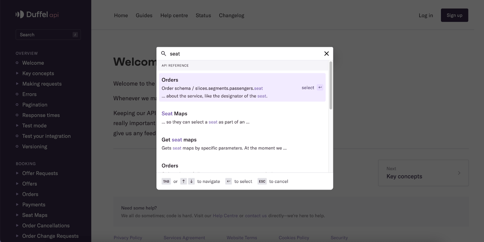
Our documentation is the main resource for developers using Duffel so it needs to be clear and easy to navigate. To lower the barrier to entry for travel sellers, we’ve made all aspects of our API publicly available in our API Reference docs without businesses needing to sign commercial agreements or go through complicated registration processes. Taking this a step further, we’ve created guides with common flight solutions like adding extra bags or collecting customer card payments.
Small features compound into a great experience, so we’ve built helpful elements like code snippets available in multiple languages with a quick copy/paste function, expandable/collapsable API attributes to show or hide more details, and anchor links to specific attributes like the passenger seat object. This is particularly useful for developers to share attributes with colleagues or reference them in internal documentation.
As we develop new features and our API grows, so does our documentation. We’ve also introduced a new search tool with keyboard shortcuts to make the docs easy to navigate. Better documentation means developers can investigate and fix bugs faster to give end users a smoother experience.
An example Duffel app
To help developers get started quickly, and to support developers of all skill levels, we recently introduced Create Duffel App. It's a command-line interface for generating a full-stack application with our software development kit integrated with a core flight booking flow. Developers can choose a front-end and back-end language/framework, add their access token and see a live example of what they can build.
We wanted a quick and simple example application so we kept the design as sleek as possible without distractions. Test orders made in the app are available straight away on the Orders page of the Dashboard, giving developers an indication of what happens in a real customer booking.
Pre-built components
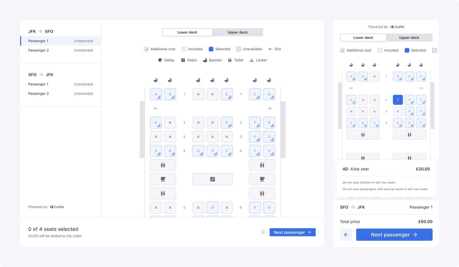
There’s a lot of complexity in travel systems and we’ve done the hard work to simplify some of it with Duffel Components: a suite of pre-built user interface components that can be quickly dropped into apps. Today, we have a Seat Selection component, Card Payment component, and Baggage Selection component.
Take the Seat Selection component as an example. Plane seats are tricky – there are hundreds of possible seat configurations. Developers need to consider galleys, toilets, aircraft wings, seat types and classes, prices, and booking restrictions. We used design thinking to standardise the information and present it in an intuitive way for travel customers. With simple iconography, clear colour coding, and responsive design, the component is easy for developers to implement and for end customers to use when choosing a seat. The component also benefits travel businesses from a commercial perspective; ancillaries like seats are an important way for travel sellers to make money. The easier it is for customers to buy paid seats, the easier it is for businesses to make extra revenue.
Visualising the invisible
Our goal is to make travel effortless. To do that, we need to profoundly consider what travel sellers can build with our tools and what those experiences look like. APIs facilitate travel booking experiences but it’s difficult to see the full picture given the intangible nature of APIs.
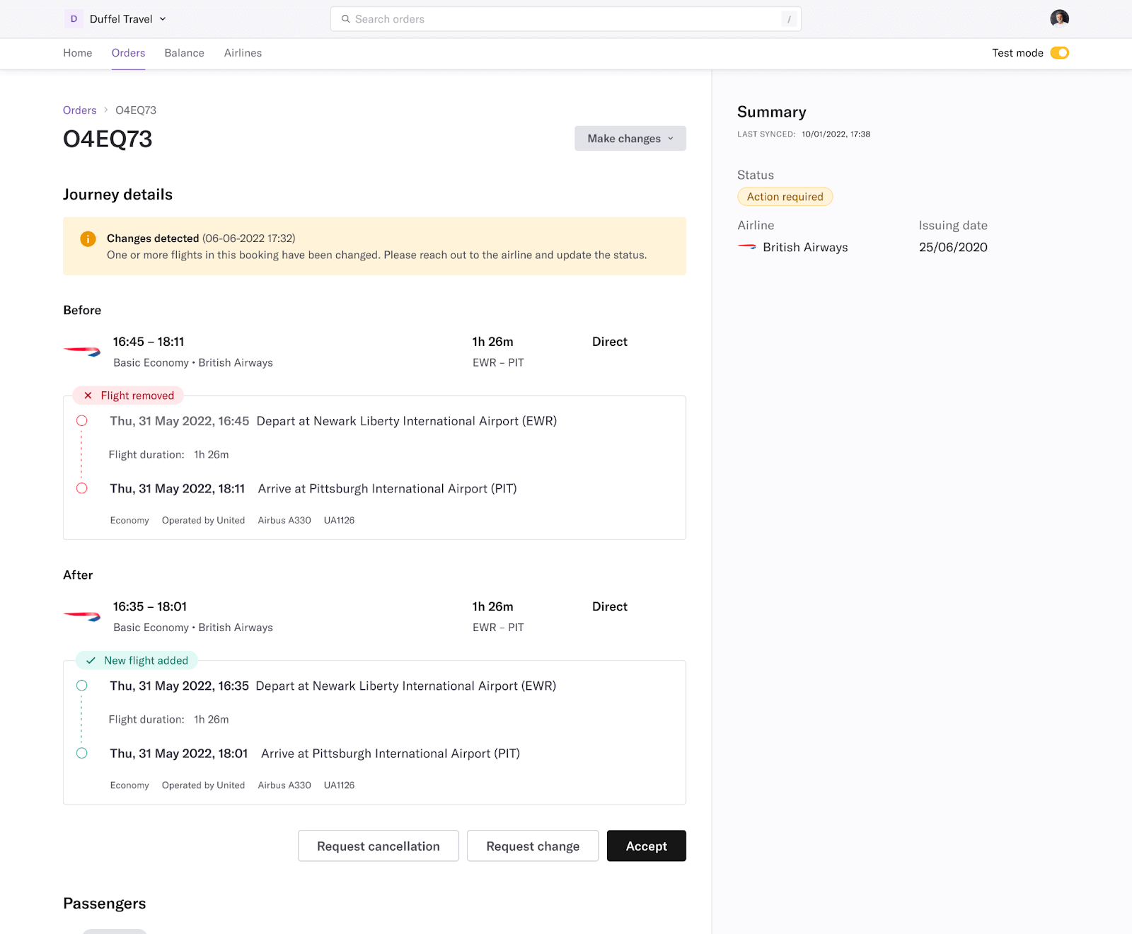
To overcome this, we found it incredibly useful to visualise the experience with the Duffel Dashboard – an online flight booking and management tool. We can test our own product, understand how users interact with new features and find and fix bugs. Our team also uses it to book our own flights, helping us learn first-hand what we like and don’t like about searching, booking, and managing flights.
The Dashboard has also become a great way for travel sellers to start selling flights quickly. Industry hurdles still mean building a fully functioning travel agency takes time, despite all the tools we’ve made available. Once developers build the core booking flows for customers to buy flights, they still need to build order management capabilities for customers and internal support staff. In the meantime, these users can make and manage bookings in the Dashboard.
In the design process, we considered a fast booking flow needing as little information as possible; notifications and quick actions for airline-initiated changes; billing and usage analytics to show monthly charges and compare sales to previous months; the ability to switch between test and live environments for comprehensive testing; and an overall simple and beautiful interface design focuses on the most important information.
Great design helps us stand out
Although design isn’t just about visual elements, these are an important part of the development process. We want to help make flight booking and management tools look fantastic. Thanks to the aesthetic-usability effect, people are more likely to perceive an attractive product as usable, regardless of its features. This has a positive knock-on effect on businesses by increasing word-of-mouth referrals, repeat business, brand trust, and willingness to engage with user research.
The travel booking experience hasn’t changed much since the early days of online travel agents. Travel websites can be outdated or slow to load, produce unexpected and unclear errors, and lack functionality like being able to manage bookings without speaking to customer support. This is in stark contrast to interactions with digital products in other industries.
In 2022, excellent user experience isn’t a luxury, it's a necessity. Where one product cuts corners, there’s an opportunity for another to fill the gap. New and existing travel sellers can apply design heuristics and familiar patterns to reduce user errors, provide frictionless booking flows, and limit the cognitive effort of users. That will not only help them achieve a competitive advantage but also contribute to a consistent web experience for end users.
We’re using New Distribution Capability (NDC) – an industry standard for distributing content – as a foundation for travel sellers to design and build user experiences with capabilities beyond what’s available today. By considering product design throughout our own API development process, and making sure our products are user-friendly and intuitive, we create a ripple effect influencing the experience for developers, travel agents, and end customers.
Using our Flights API to design great experiences
Duffel is your complete toolkit for selling flights online. You can get started quickly as an authorised travel seller and access content from hundreds of airlines using our industry accreditation and airline ticketing authority.
You can also use comprehensive developer documentation, client libraries, and pre-built user interface components to make building great experiences easier for your engineering team.