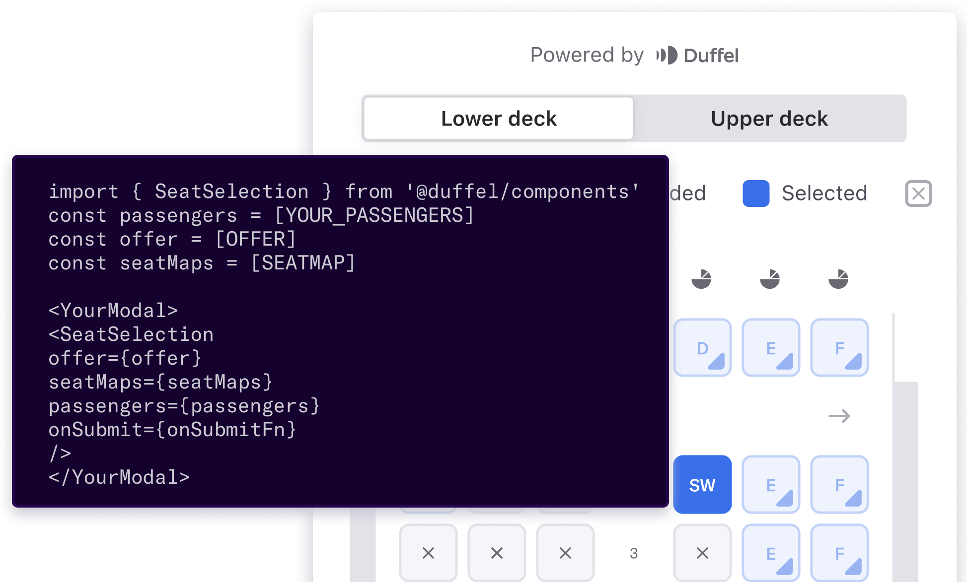
Duffel Components: Build beautiful and intuitive flight booking experiences
Today, we are launching our first ready-made component for seat selection that can be quickly dropped into your website to delight and empower your customers without having to build complicated UI.

Today we're launching Duffel Components, a suite of drop-in components that make it even quicker and easier to build a fantastic travel experience.
As we've explained previously, Duffel is all about making it faster and easier for anyone to integrate flights into their website or app. And as a travel seller, one of the big challenges is presenting rich, detailed information to travellers in a clear, intuitive, and interactive way. Duffel Components make it easy to delight and empower your customers and quickly drop into your website without the need to build any complicated UI.
At Duffel, we already provide a quick, simple, and consistent API for selecting seats (currently for American Airlines and Qantas, with more airlines on the way!) Even with a well-designed and fully documented API, turning data into a beautiful seat map for your customers to use isn't easy. That's where Duffel's first component, Seat Selection, comes in.

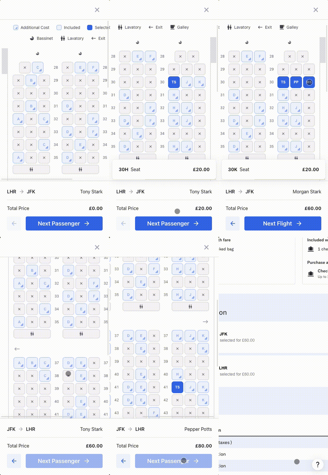
Seat Selection, allows you to launch a seat selection map on your website in no time. We take all the necessary information from the airlines (including seat price and placement) regardless of how it differs per plane and present it in a way that your customers can easily see and understand. Seat Selection can handle all of these nuances and allow your customer to find their perfect seat.
We've built this component so you can avoid spending weeks or months building your seat map and instead focus on providing a great travel experience for your customers.
Our JavaScript component can be dropped into any website and integrates seamlessly with the Duffel Flights API – all you need to do is include the component on your site and pass in the data you get from the API. Now your customers can select their desired seats for all the flights and people travelling in their booking.
We've tackled several key challenges and built a component that gives your customers a great booking experience all whilst staying true to your brand:
- Information: Seats on airplanes can have lots of information attached to them - cost, restrictions, additional notes, to name a few. We show the full context.
- Placement: Your customer wants to know where they're sitting on their plane, which seats have extra legroom, which seat is furthest from the bathroom and if the wing obstructs their view out the window. To make things even more complex planes come in all shapes and sizes, and even the same plane can have different seat configurations. We show your customer exactly where they'll be sitting.
- Responsiveness: Travellers expect to book from any device, and selecting their ideal seat is no different. The Seat Selection Component is fully responsive and designed to provide a great experience whether your customer is booking from their phone, tablet or computer.
- Customisability: We know that continuity of user experience is important for every business. That’s why we have made it possible to customise the colours used in this component, so you can tune it to match your brand.

How to get started
To get started with the Seat Selection Component, you can follow the guide, which will walk you through making an order with the traveller’s chosen seats reserved.
Check it out and let us know what you think!
If you haven’t got round to making orders yet, you should follow the quick-start guide, where you can start making test orders in under 10 minutes!
Coming Soon!
More Duffel Components - next up, a way to help you take payments from your customers more easily. Read more about Duffel Payments here and sign up for early access.
